A good website is one of the fastest ways to connect with your audience to gain sales. On the other hand, a bad website is the quickest way to lose your audience and customers. Suppose you need help with maintaining traffic on your website. Your website may need to be built more optimally and is driving traffic away. Here are some ways to fix your website and have traffic incoming again.
Table of Contents
Missing Fonts
To adequately market your business online, you require a website that portrays your company and brand. Otherwise, you’re falling behind the present.
According to Forbes, 38% of users will abandon your website if the layout is unattractive. A poor website layout can negatively affect your sales if you hire a freelancer or a website development agency, consequently generating less revenue.
Below are five signs your website is not making the most out of it. If you notice these five signs, it is time for a revamp.
Missing Focus
When somebody visits a website, they do that for a purpose. Odds are they’re looking for a product or service. In other circumstances, they find a brand that meets their preferences. On the contrary, a lacking website focus can perplex your visitors. The minute the site loads, visitors should understand who you are and what you do. Otherwise, they’ll spend precious time looking for clarity.
The Solution
Make sure to showcase your products or services effectively. All the pages of your website should have a definite purpose. Scrutinizing each page with a unique title will accommodate your site visitors to recognize why they should traverse your site instead of someone else’s. Once your product or service provides a clear picture, promote the page with added design elements. For example, you can include recommendations or certifications at the bottom of the page to build brand trustworthiness.
Erratic Design
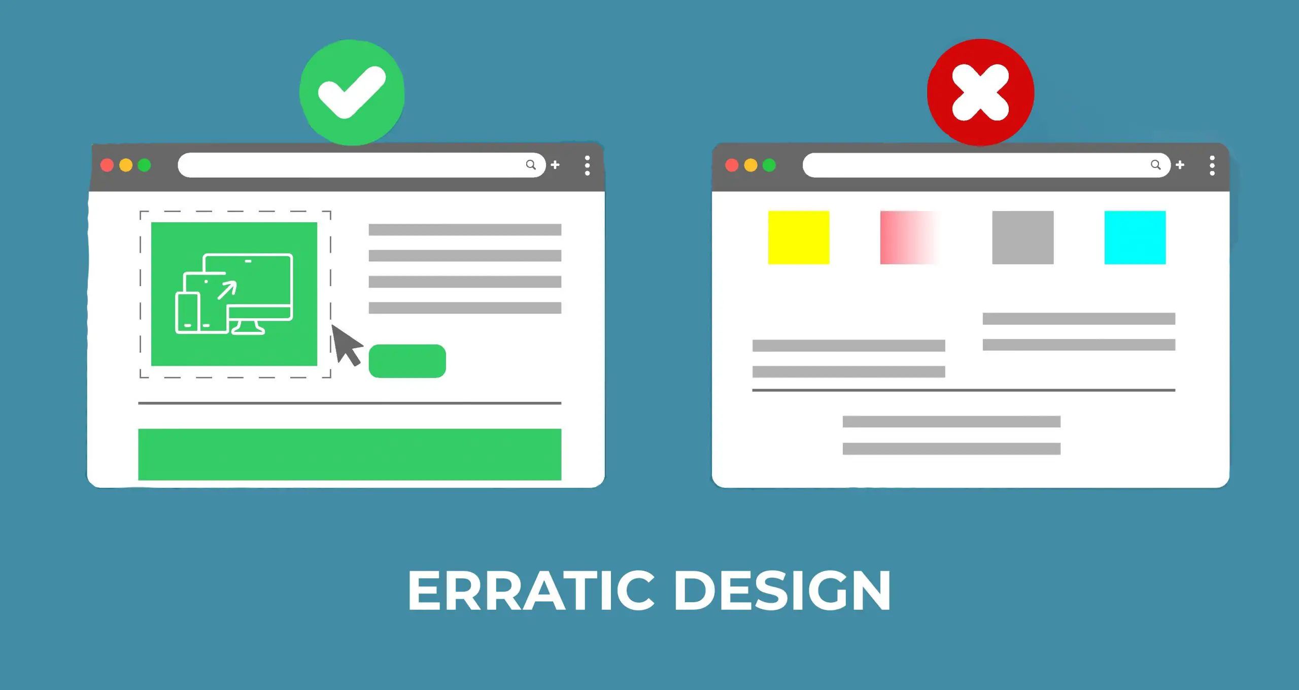
Erratic and consistent design leads to a better website. When visitants navigate from one page to the next, they anticipate seeing the same recurring components.
If a visitor jumps between pages and finds an entirely new design, they might feel bewildered. In some instances, radically contrasting designs can make visitors think they’re on a different website.
The Solution
Instead of leaving visitors confused, keep some elements constant to ensure good web design. These elements include fonts, layout, color schemes, the header and footer style, and overall branding. Keeping these repetitive elements consistent subconsciously reminds visitors they’re on the same site.
Inadequate Navigation

How do website visitors jump from one page to the other? Bad website design makes it challenging for visitors to explore. Without organized navigation, you’re leaving visitors stuck on a particular page.
The Solution
Make sure the navigation bar is clear, apparent, and organized. More subpages can leave visitors feeling mislaid. Alternatively, feature the most important pages within your top bar navigation.
Make sure visitors can click each navigation link. Check to make sure the navigation headings are correct. You can also supplement a search bar to your site.
Adding a sitemap will further aid your visitors in navigating through your website.
Poor Optimization
When you do not optimize your website to cater to users from other devices and focus only on the desktop, you alienate all other users as they cannot navigate your website effectively, especially when those users are on mobile devices.
A mobile-friendly website is integral to generating business, as most users are on mobile when surfing the internet. It is important to ensure that navigation is seamless and consistent for mobile users.
The Solution
Create a mobile responsive website, and use Google’s mobile-friendly test to determine how responsive your website is. The changes you will be required to make include removing flash, compressing images, and adjusting the text and button sizes to fit the mobile dimensions.
Poor Image Quality

In its reports, Adobe concludes that many visitors prefer beautifully curated content with good visuals. Adobe concludes that the number is 66%. To keep this majority on your website, add visually attractive images and elements and let them speak to the visitor for you.
The Solution
To enhance your website design, use better stock images. Instead of using images to fill space on the page, ensure they align with the text and complement your content. It will be eye-catching and will keep visitors engaged with your content.
When using pictures and illustrations on your website, ensure they’re high quality instead of pixelated.
The best pathway would be hiring a professional photographer to connect your audience with your products better.
Poor Choice of Keywords and Meta Tags
Keywords are one of the hearts of a good website. It is one of the ways google identifies your website. So labeling your products with the appropriate words and tags is integral to ensure that when someone searches for a product. Google can then determine that keyword in your website and push your product to appear higher in the searches.
The Solution
Research is important when it comes to finding the best keywords. You need to figure out what keywords are the most relevant to your product. You need to know what keyword is used and determine if it is seasonal. Seasonal keywords only appear during a period and not all year round (e.g., Santa, Halloween). Do some keyword research and find out what keywords get the most searches and link them with your products.
Poor Alternative Text (Alt Text)
Alt text is a description typically describing an image. It links the image to the text if a user cannot view it for any reason. If your pictures and alt text are not appropriately labeled, google will not know how to link a text that describes your product/website image. It results in a poor ranking on Google, reducing the likelihood of your website making it to the top.
The Solution
When adding images, ensure your photos are named properly, and your alt text describes your image perfectly. For example, if you add a black cup, your image and alt text should be labeled “black cup.” This way, your product, alt text, and keywords can now be easily identified by Google when a customer searches “black cup.”